


For our final project we printed using a design of our own. We used Adobe Illustrator to create vector art that was then sent to a vender to create a type-high block with our artwork. We set up our press and printed away!


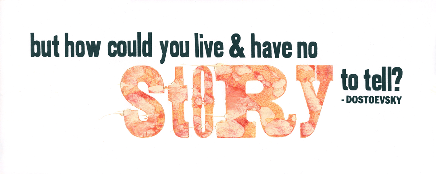
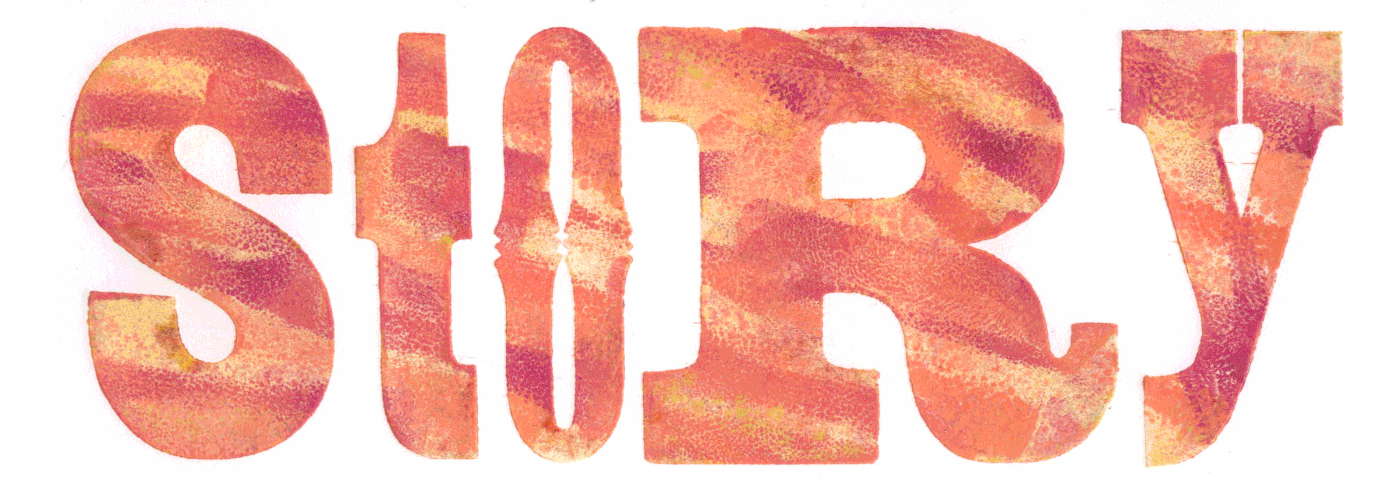
This project explored more experimentation with typesetting, ink and color. "Story" for each print was unmethodical and sporadic. Color, thickness and patterning was done at random to create a textural look.


This first assignment taught the basics of setting type, measuring, inking and proper clean up and care for the studio supplies. Setting type for a sarcastic note on business cards was the ideal way to start off the semester.

This project is a meticulously designed mash-up print with three different layers. We were tasked with using a variety of printing materials, icons and text, found within the studio to create a piece with meaning. This print promotes the idea that people will create their own ideas, notions, opinions and decision about who you are, sometimes without ever taking the time to understand who they are as an individual.


